


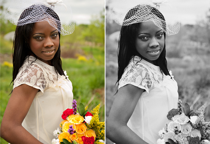
Before I left on vacation, I posted a side-by-side comparison on my Facebook page. I asked my readers which photo they preferred. It was a close race with the majority choosing the color version. However, I did have a few people suggest a third option: a BW version with color accent. I found it to be the perfect opportunity to explain why I don’t do selective color in my work. Let’s start with the side-by-side comparison:
In the color version, the composition draw the eyes from the face, down her shoulder and arm to the bouquet and back up again. The colors in the shot help guide the eyes through the composition, but still the focus reverts to the subject’s face. In the BW version, the eyes are immediately drawn to the subject’s eyes, though stunning in the color version, don’t have as much impact as they do in the BW. In both the color and BW versions, the focus is always the subject.
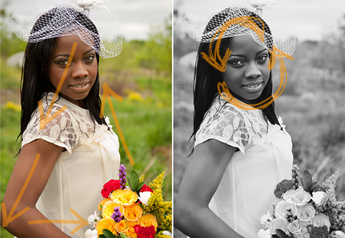
In the selective color version: the focus is now on the flowers detracting the attention from the subject’s face. I find this to be the case with most selective color images I’ve encountered and why I am not a big fan of the effect, especially since my aim is always to bring the focus to my subjects. But here’s the bottom line: selective coloring is just one of the many photography trends that may look cool today, but will most likely date your photos in a few years. Like all trends, it has a limited shelf life. My hope with every session is to create memories that will stand the test of time. I try to keep all “extras” to a minimum and focus on creating images that you will love today and hopefully, for a very long time!

Mindy - excellent points, Maddy! I totally agree with you that some things around now seem to be the next “white shirt with jeans” of our time. I think another good example are the infant composite pictures that are so popular now. Those squishy little faces propped up on hands are cute, but I dont think they are going to lend to a timeless photo. plus, they are hard to do, so I also try to avoid them for that reason, too :)
Life with Kaishon - I agree : ) I really am not a fan of selective color for that exact reason! I want to see a face! : ) I want to focus on a face. I think this post was perfect. Thank you for sharing. LaTonya looks amazing in these images. She is a beauty.
Camila Faria - I totally agree Maddy. And I find the B&W picture stunning!!! Definitely my favorite!
Adrion - I am was never a fan of selective color of anything that is overly saturated. Now I really need a tutorial on your post-processing. You really have some MAD (no pun intended) skills in post processing. :)
here’s the tutorial link i promised to send.
http://www.planetneil.com
Sabine - You explained in clear, logical words what I always intuitively felt (without any understanding why) – I just refuse to use this effect. I recently had a discussion about this for a new project and when someone in the group suggested it this was my only No. Additionally to all your points I’m finding it looks too much ‘Look, I know how to use Photoshop’ to me. Beautiful photo, Maddy!
Maddy {Mad Hearts Photography} - You’re so right! Every Photoshop newbie (myself included!) has attempted this once before :)
Maddy {Mad Hearts Photography} - Awww…thanks Adrion! Seriously, I find that I use Photoshop less and less these days, relying on getting it as “right” as possible in camera and really just boosting contrast, sharpening and light skin retouching. No secret…just everytime I think it’s “perfect”, I tone it down just a bit further.
And thanks for the link! I’m definitely going to check it out :)
Elly - Good call, hey. I’m not a huge fan either, and it’s a relief to have it explained :)
Hannah - Perfect explanation for how I feel!!
Keeley @ My Life on a Plate - Great explanation! Selective color was the hot thing when I got married 7 years ago and I can see now that it would date an image. I also agree with the comment about the newborns in the squishy poses with all the props… it’ll get dated. I’ll remember that when we’re photographing our baby later this summer.
I love the images you composed for my maternity shoot. Everything looks natural and relaxed, just like we try to be. I want photos that will go in our family archive forever and not scream 2012.
Maddy {Mad Hearts Photography} - You guys are the perfect example: your happiness just radiated through in your photos! Why would I ever want to detract from that?! Someday Baby P will be big enough to go through the pictures and see how happy and excited you were for his arrival – not the selective color of your red shirt (or something along those lines) ;)
Sarah - Wow this is an excellent point! I never thought about that!
Kristin - I much prefer the photo without!
Amy - Fabulous points, Maddy!
Otilio - Also, its just plain tacky!!!
Charisma Moran - I HATE selective coloring and will never use it. To each their own though, I guess.